
A Gift of Words
Many years ago I created a powerful but inexpensive set of gifts for important people in my life. I've had many people ask me for a guide, so here it is. The finished product is a message or poem to the person, in the shape of her/his name.

You'll need two pieces of software, both free:
- A simple graphics program. For this demo, I'm using Paint, which comes with Windows 7. There are freeware programs available for Mac and Linux, or you can use a website like Pixlr.
- A desktop publishing program. Your best choice here is OpenOffice, since it's free and (relatively) easy to use. (The following screenshots are from OpenOffice.) Other programs may suffice, but the key ingredient is a way to wrap text -- and edit the wrap points.
Note: You can click on the screenshots below for full-sized versions.
Step One: The Name-Picture. First we need to create an image of the name. For this demo I'll use the word "Mom". In Paint, start a new document and write the person's name.
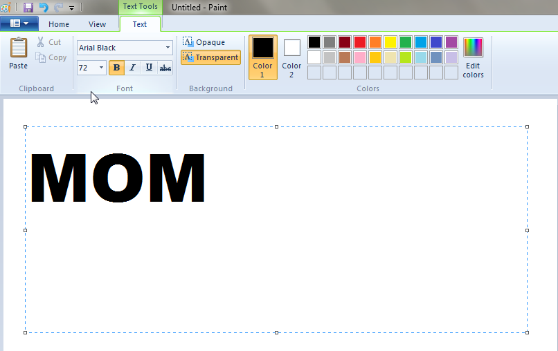
Use a thick, bold font like Arial Black or Impact. We want lots of room inside each letter to fit the little bitty words.


Step Two: Import the Name. In OpenOffice, start a new word processing document, and import your name-picture. (This is found under "Insert > Picture > From File...".)

Find your name-picture and bring it into the OpenOffice document. If necessary, enlarge or reduce it to the width of your page.
Step Three: Basic Wrap. Now we begin the tricky bit. What we'll be doing, in essence, is telling OpenOffice to wrap the words you type in Step Four around a certain contour. (Normally this is done to make sure text flows around a photo, as in this page. We're going to use this tool in an unusual way.)
With your name-picture selected, choose "Contour Wrap". (This is found under "Format > Wrap > Contour".)

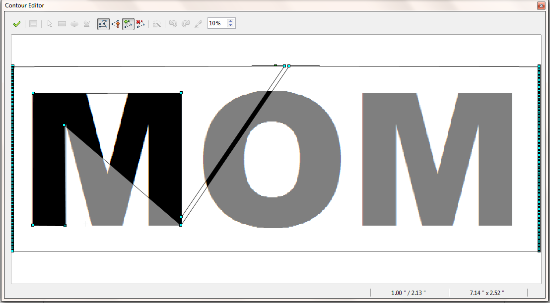
Then we need to edit the contour. As you can see in the screenshot above, this option is in the same menu, just below the "Contour" option. You should see the Contour Editor:

Click on "Edit Points" and then choose "Add Points". You'll be able to click between any two green dots and create a new point. (Dragging a little may be necessary for the new point to appear.) Start by making new points in the shape of a triangle, as I've done above.
(Notice that we've made a hollowed-out triangle inside the larger box. If you simply move the points into the shape of a triangle, the text will move around the outside of your shape.)
Click the green check mark on the left side of the "Edit Points" window and you should see a white triangle through the middle of your name-picture. When you click away from the name-picture, you should be able to type words -- and they'll show up inside your triangle.

Step Four: Placeholder Text. Type a few lines just to give us some text to work with. (Don't worry, we'll adjust this later.) Then make the size very small. I recommend 6-point text. (Any larger and the words won't fit very well. Any smaller and the printing may get tricky.)

Copy your placeholder text and paste it several times, so that it fills the triangle. (Don't worry if you spill out of the triangle; it will simply appear below your name-picture.)

Step Five: Wrap to Letters. Select your name-picture again and go back to the Contour Editor. Add new points -- and move the existing ones -- to change your triangle into the shape of your first letter. (We're lucky that "M" is just straight lines. You'll have fun making round shapes later.)
Remember that you need to wrap the points around the outside of each letter. (It's sort of like wrapping a sandwich in cling film.) Don't panic if you make a mistake -- if something goes wrong, just close the Contour Editor and choose "no" when asked if you want to apply your changes.
When you finish the first letter, your points should look like this:
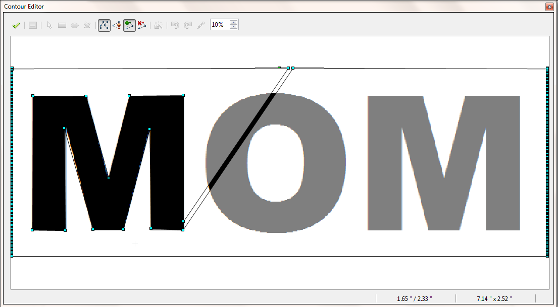
(Notice the canyon from the top edge. It must be thin, so none of our words get smooshed inside it. You'll add more of these as we continue.)
Click the green check mark again and you should see something like this:
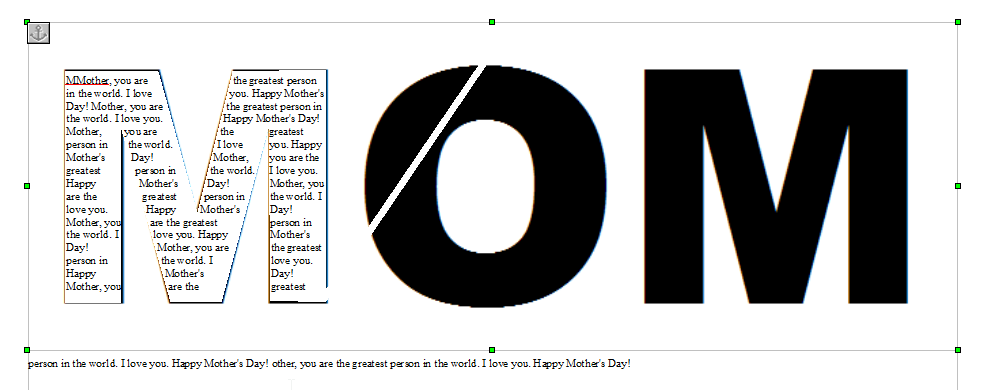
(Notice the spillover text on bottom, as noted. Don't worry about deleting it right now. All of this text will be moving around constantly.)
Step Six: Minor Cleanup. Now we'll do a couple of small adjustments to make things look nice. These can be done at any time, but they must be done before printing the final product.
You obviously don't want the black "MOM" letters behind the text of your message or poem. There are several ways to get rid of it, but this is easiest: Select your name-picture and the "Picture" mini-editing window will appear. Use the arrows to set the transparency to 100%.

The word will appear to vanish. (Again, you might prefer to do this later on, or put the transparency at 50% for now.)

Note the green dots still appear when you select your name-picture, which shows that it's not gone. (Besides, the contour wrap is tied to the name-picture, so if you deleted it, your text would become boring old straight lines again.)
Next we want to justify the text so it fills the letters of your name-picture. (I'm a big fan of justified textworks, in case you hadn't noticed.) Simply select your text and choose the "Justified" icon on your toolbar.

The result will look more polished and full:

Not every line will extend to the edge. You can fix this later by choosing different wording, playing with font sizes, and inserting hyphenation. For now let's finish wrapping our contour.
Step Seven: Finish the Contour. Select your name-picture again and return to the Countour Editor. Continue adding and moving points to wrap around the rest of your letters.
Notice that for a letter with negative space inside (like the "O" in our example), you'll need to make another canyon inside the black space. (Also -- rounded letters require lots of contour points. Don't bother adding too many; we just need something approximating a normal curve.)
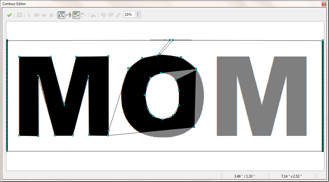
When you finish, your contour points should look like this:

Click the green check mark and your text should fill each of the letters. (If it only fills the tops of your letters, copy the placeholder text and paste it enough times to fill your letters up.)
You should have something like this:
(Note that the canyon we used for the negative space in our "O" appears to have left a scar in that letter's text flow. You can adjust your contour points to fix this.)
Step Eight: Polish the Text. Now comes the part where you unleash your inner poet. Replace all the placeholder text with your kind, loving thoughts and feelings about your person. You'll need to write carefully, to make sure it fits just right inside the big letters.
I probably spent an hour just writing the text itself. You may have some difficulty finding the right words, and even more difficulty making them fit. Just remember that this is something s/he'll keep forever, and probably hang on the wall for everyone to see. Put some time into it!
Step Nine: Print onto Nice Paper and Frame. You can buy fancy paper and put it in your home printer, or you can print your text on plain white paper and take it to a copy shop, which will have fancy paper. (The advantage there is you only have to buy one page.)
Notice that right now our finished product is the width of an 8.5" page. You may want to make your name-picture bigger, to fit an 11" landcape orientation for easier framing. ("You mean I'd have to do the contour editing all over again!?" Yeah, you will.)
Good luck and have fun!